When I was a child, my mom had (and still does) an affinity for pens – all sorts of pens, in all shapes and colors. I would browse through her collection and “adopt” my favorites for myself. Thanks to her, I was introduced to fountain pens and ink early on. I have fuzzy, vague recollections of syringes and injecting purple ink into the empty, disposable cartridges (it was so long ago, I think they haven’t invented converters yet).
That was many years ago, and now, in my forties, I am discovering fountain pens all over again.
The bottom line:
Parker IM Fountain Pen:
- Cost: Fountain pen 40$ + Parker converter 10$ > at BHV Marais, Paris, France
- Medium nib
- Smooth writing experience
- Nice ink flow
- Too heavy for me to hold, hand hurts after a short while
- Slightly too thick and short for my hand
Sailor HighAce Neo Beginner Fountain Pen:
- Cost: Fountain pen 16.5$ + Sailor converter 8.25$ > at Jetpens.com
- Fine nib
- Scratchy on the paper (In some cases even bruising the paper)
- Fine line, pleasurable despite scratchiness
- The lightness & slimness of the pen are perfect for me
Ink
Platinum Carbon black ink:
- Cost: 60ml. bottle 25$ > at Jetpens.com
- Nice, smooth ink
- Good “blackness”, but not the optimum rich, saturated black I was hoping for
- Waterproof : Supposed to be waterproof. It depended on the paper in my tests
Smeared on sketch pads, held pretty well on watercolor paper
Pelikan Tusche A Black #17:
- Cost: I forgot! Should be fairly priced & easily found
- Wonderful “blackness”- rich, dark color
- Not to be used in fountain pens!
Parker Quink washable blue:
- Cost: About 6$ for 2 packs of 5 cartridges
- Disposable Cartridges
- Washable! That’s a disadvantage in my case
- Color comes out a little uneven
- Wonderful ink flow in the Parker pen


Pelikan Tusche A black drawing ink. Do not use in fountain pen! 
Pen: Sailor HighAce Neo Fountain pen. Ink: Platinum Carbon waterproof black 
Pen: Parker IM, Ink: Parker Quink washable blue 
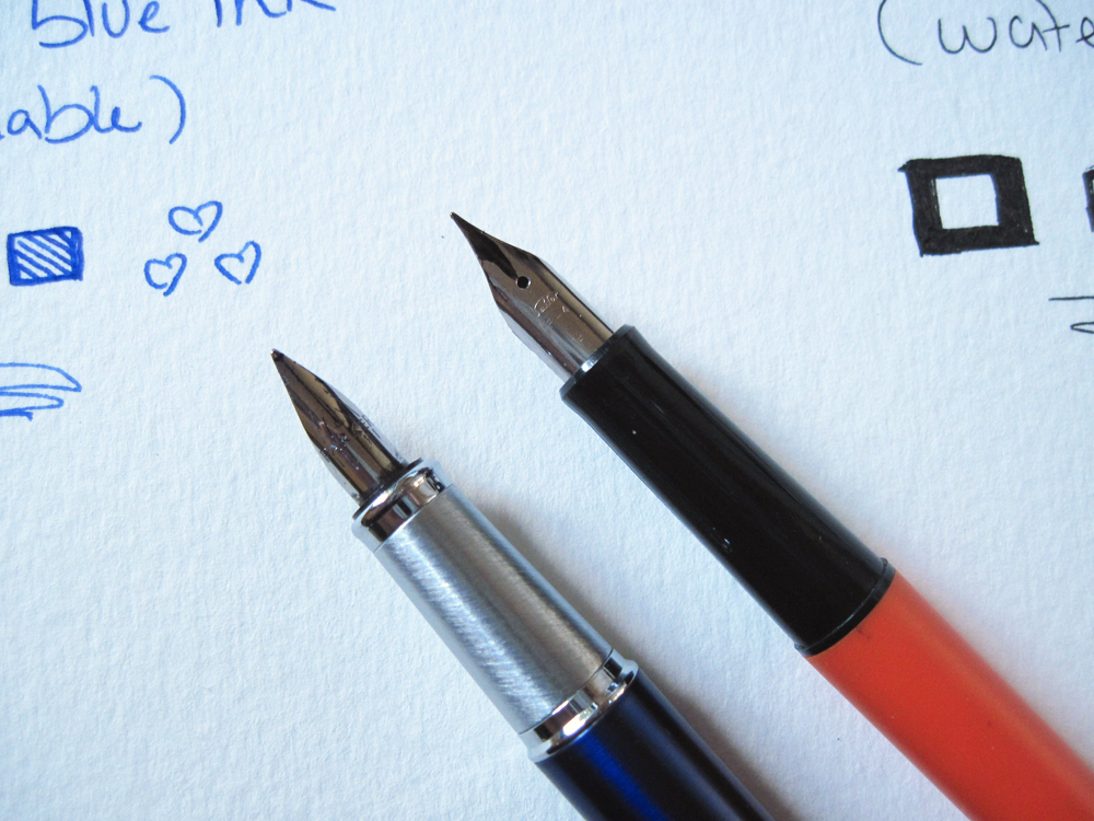
Nib comparison 
The Parker is the blue pen on the left, the Sailor is the orange pen on the right 
Nib comparison up close 
The full story:
I got the Parker IM on an impulse in Paris, the minute I held and tried it, my very first impression was: “It’s so heavy!”
I was rushed, and so just bought it, my rationale being: I’ll get used to it, fountain pens are supposed to feel heavy, Parker is a renowned company – it must be a good pen.
My first trials with it were with the Parker Quink blue ink. I didn’t like it at all. The ink felt flimsy, diluted, an inconsistent faded color (flick the top of the ink resevoir – it will help it flow more smoothly). I did give myself time to try it out, but the pen still felt heavy for me to hold – My hand and fingers would hurt after a short while. Trying it capless didn’t help, as then it was just a tad too short for it to be comfortable to hold.
When we got home from France, I loaded it with Pelikan Drawing ink (Black #17 – Tusche A). The black ink flowed nicely, felt rich and smooth, but looking online, I learned this ink will clog and destroy my new pen…!
Fast forward 2 months – I read recommendations about the Sailor HighAce Neo. Sailor seeming to be a really good company, producing quality pens (I read about and craved their gold nibs). The HighAce Neo is one of their cheaper options, it even says in the title “For beginners”, which suited me fine, realizing I better try and figure out what works best for me before spending a fortune.
I coupled it with black ink, this time suitable for fountain pens – Platinum Carbon ink.
I chose this ink since it is supposed to be waterproof and a nice dark hue.
So – The Sailor HighAce Neo is indeed lighter and much more fun for me to hold. It is slimmer than the Parker (and from most pens from what I gathered), the body is mainly plastic adding to its lightness, and it is longer as well. The Platinum Carbon ink is pleasingly black, quite rich (though not a true, brilliant black) and on some papers I tried it on the ink would smear a bit, even after resting overnight.
The Sailor nib is fine and leaves a delicate line. It is much more scratchy on paper than the Parker. On the watercolor papers I use it’s fine, but trying it on some sketch pads (Canson & Tekenbloc) it bruised the paper. Actually, it served the point in a twisted way – when the paper got bruised, a tiny piece of paper would get caught in the nib, sucking more ink I suppose, and then giving me a smoother, more affluent ink flow!
As you can see, I am not writing about how the pens look, whether the clicking sound of the cap is satisfying or not, etc. – as I’ve been reading in all (!) the fountain pen reviews I read. People seem to care a lot about how their pens look. I regret to tell you I don’t… I buy my materials for their use, not how pretty they will look on my desk. While I do not dispute the importance of aesthetics, in this case it is completely irrelevant for me. And I may be too much of a novice to realize the importance of the cap clicks.